-
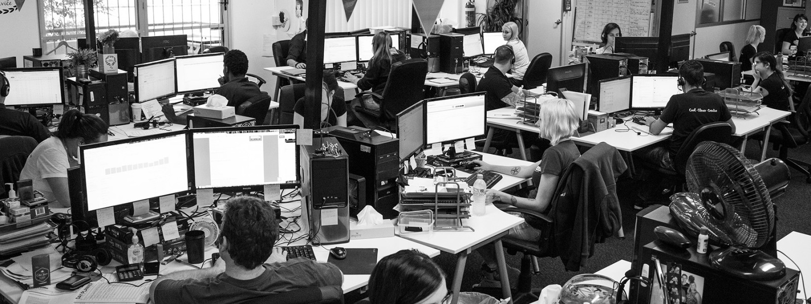
Traffic
Get More Traffic
SponsoredLinX offers a number of different services to help drive more qualified traffic to your website. Google Ads Management Search Engine Optimisation Microsoft Ads Facebook Advertising Google Ads Mobile“SponsoredLinX are a rarity in today’s market place, they promise a lot but deliver more. Our business has grown by over 400% in one month; we are amazed at the difference they have made.”
-
Conversion
Convert More Leads
Our second step is making sure that your website is able to convert the traffic you receive into leads for your business. Optimising your website to convert more leads is important to a profitable campaign. Web Development Convertopages Do It For Me eCommerce“I just want to say thank you! The changes that you have applied in our AdWords campaign have definitely seen an improvement on click quality and sales for HippityHop.”
-
Retention
Retain Your Customers
As you build up a customer base you need to make sure to keep engaged and retain your relationship. LinX App“SponsoredLinX fully redesigned our main company website with a fresh, clean and professional look. The ‘Google friendly’ web design were part of the fantastic ongoing service we received.”
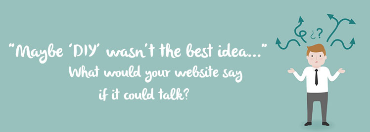
“Maybe DIY wasn’t the best idea…” – What would your website say if it could talk?
Building your own website can seem like the smartest option when you’re budgeting your hard earned cash. But if you’re not careful, it can also create more issues for you later on. Below, we give you the top five questions your website would ask you if it could, and uncover some of the biggest mistakes small business owners make when deciding to ‘DIY’.
#1: “Do I have too much going on?” (Translation: Is my website too cluttered?)
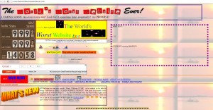
No-one knows your business better than you right? That generally goes without saying. But before you go bombarding your readers with every brilliant idea you have, woah there Nelly! Remember, less can be more.
When building or having your website designed, consider the following:
- What are the most important things that my audience need to know about me?
- Do my images add to, or detract from the appeal of my website? Remember, too many images can appear distracting
- Is my written content easy to read or is it filled with grammatical errors and inconsistent fonts? Having too many different styles going on is not a great look.
- Can my readers find the info they need easily? Is it easy to contact me through my website?
#2: “Am I boring you?” (Translation: Is my content doing what it should?)

This follows on from the previous point about cluttered websites, but again we must stress: make sure your content is easy to read. Content should not only be engaging and informative, but also well formatted.
When online, most people skim through information quickly to find the most relevant or interesting information, and attention spans are often short. Making your page look packed out and content heavy is sure to make the time-poor reader quickly feel overwhelmed. Before you know it, your website has been deemed ‘too much work,’ and they’re already looking elsewhere.
A few quick and helpful tips include:
- Make sure you use headings, bullet points, and bite-sized blocks of text to ensure your content is more ‘digestible,’ so to speak.
- Consider the age of your target audience, and adjust font sizing or smartphone readability accordingly. It’s also important to make sure your line spacing isn’t too squishy.
- When it comes to font colours, try using grey coloured text on a white background. It’s much nicer on the eyes than bright black fonts.
If you follow these tips, hopefully your website will be saying “Hi there, how can I help you!” instead of “Hello, is anyone out there?”
#3: “Why am I here?” (Translation: What is your website’s purpose?)
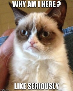
Before you can expect your customers to get to know you and your business, you first need to understand what your website hopes to achieve. Ask yourself:
‘Does my website have a clear ‘Call to Action? Do my customers know what they can get from it and why they should be on here?’
For example, picture yourself trying to keep up to date with the latest news on your favourite exercise blog, and finding there’s no ‘sign up now’ button? Or try to imagine doing your online shopping, and finding there’s no ‘add to shopping cart’ button below those Foo Fighter tickets you’ve had your eye on for days.
CTA’s are important! Make sure your audience know why they’re on your site, and how to get what they want.
#4: “Is this a job for the professionals?” (Translation: is a DIY website your best option?)
DIY disasters don’t just live in the real world – they can extend to your website too! And while you don’t necessarily have to be a graphic design whiz to build a basic website for your business, you do need to ask yourself this:
Do I trust myself to take this massive task onboard? Am I the best person for this job?
There can be good reasons for choosing NOT to go down the DIY path. I’m sure it goes without saying, the last thing you want are potential customers turning away because of a poorly designed website.
#5: Is my spirit animal a sloth? (Translation: Is your website too slow?)

Did you know that Google ranks your site based on its speed? Well, it sure does, and the last thing you want are pages and images that take too long to load. Always check the file size of your images – if you’re trying to upload an 8GB file, chances are your readers are going to find themselves frustrated, and before you know it, they’ve clicked exit on your site. This isn’t a case of ‘slow and steady wins the race.’ At the end of the day, a slow website is a dead website.
Programs like Photoshop or Tiny JPG are your best friend when editing image sizing. If you can, try to keep your images to 70KB or under.
If you’re after a website that’s more ‘yooohoo!’ and less ‘snoozeville’, contact our savvy SponsoredLinX team on 1300 859 600!
